A About Colors
Most visualization tasks in R are enhanced by the use of color. Color can make groups stand out or make it easy to quickly determine what a graph is saying.
A.1 Basic Colors
Consider the following plot of the faithful data frame.
plot(faithful,
     main = "Old Faithful Information",
     xlab = "Eruption Time",
     ylab = "Waiting Time",
     pch = 19
     )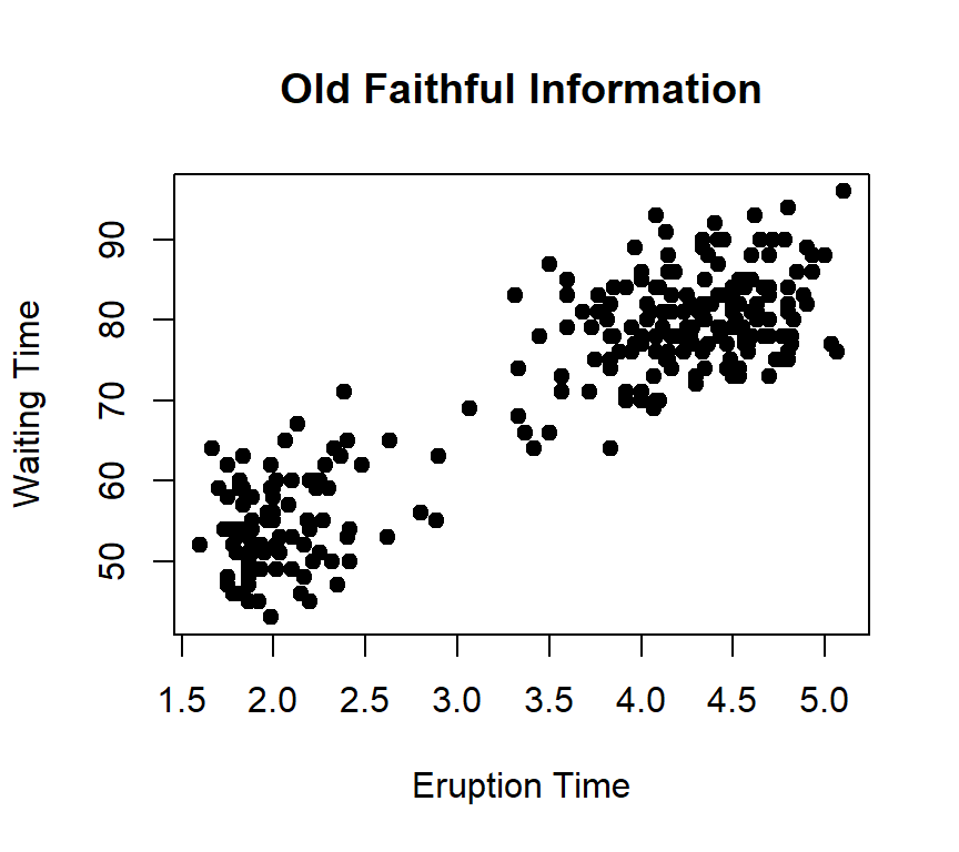
The dots in the above scatter plot are black and easy enough to see, but R can color the dots in order to make the visualization more appealing and, perhaps, enhance the readability of the report. R has a vocabulary of 657 basic colors (including 99 levels of grey), and those color names can be spcified with any plot. A PDF file, Rcolor.pdf, is available that lists all of the colors along with a small sample of each.
As an example, the following code chunk draws the same faithful plot displayed above, but the color firebrick3 is named on line 6 so the dots are a red color. That color can be changed to any of the 657 colors available so the plot meets the researcher’s needs. The color specification in the following script can be changed and the script re-run to explore the available R colors.
When using color with graphics it is important for the researcher to keep two points in mind.
First, it is estimated that about 8% of males and 0.5% of females are unable to distinguish between two or more colors, a condition that is often called “color blindness.”
Second, if the research is ever printed in a black-and-white form then all color information is lost.
For these two reasons, it is probably best to not rely on color alone to provide information to the reader; rather, color should be used to enhance the understanding of a chart without being a sole source of information for that chart.
A.2 Color Palette
Often, a visualization will require more than one color to properly display the data. Consider, for example, this bar plot from the mtcars data frame.
barplot(height = table(mtcars$cyl, mtcars$gear),
  main = "Cars by Gears and Cylinders",
  xlab = "Gears",
  ylab = "Count",
  legend = TRUE,
  beside = TRUE,
  args.legend = list(title = "Cylinders")
)
Since no color is specified, the default colors are applied. The shades of grey are useable but there are easy ways to make the plot more pleasing and useful. R includes five color palettes that contain multiple color combinations and those can be used with visualizations that require more than one color. Here are samples from the five primary color palettes.
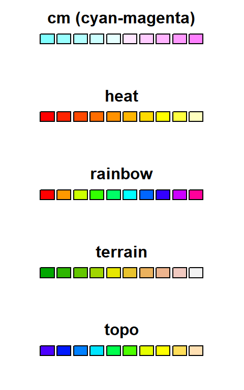
The palettes are applied to a visual with the col= command. The number of colors to use from the given palette is specified in the parenthesis following the palette name. Here is how each of the palettes are specified in a visualization.
- col = cm.colors(5)
- col = heat.colors(3)
- col = rainbow(7)
- col = terrain.colors(8)
- col = topo.colors(4)
Adding the heat color palette on the last line of the script for the barplot makes it easier to read. This is an interactive block of code and the palette can be changed to explore these five palettes. It may also be interesting to change the number of colors to see how that changes the actual colors selected.
A.3 Custom Palette
Designers must be careful about using multiple hues on a single visual display since that creates what is sometimes called “clown’s pants” due to the extreme patchy color scheme. The goal of using color is to make visualizations easier to understand, but plots with too many colors can be distracting and render the data confusing. Instead, it is generally a best practice to use only shades of the same color or gentle gradients from one color to another. For example, the following script produces the bar plot seen in the previous figure but using only shades of blue.
The first line of the script creates a custom palette named colpal (for “color palette”), which, essentially, creates color codes for plots. In this case, the function will create the codes for color gradients between blue and white. Note: While any two colors can be specified for colorRampPalette, only one hue should be selected along with either white or black in order to make plots more usable for readers who are color blind. The col= line sets the color for this plot by using colpal and specifying three colors. To explore this capability, change the colors in the colorRampPalette() command and the number of colors to select and run the script.